Dave Jeffery's
Flash-free Files 1
Created We 1-Mar-17
Updated Mo 1-Dec-25
Contents
- Idents - the BBC liked to build moving models to represent the channel or service you were watching.
- Clocks - mechanical and electronic timepieces that used to be seen before the news or at closedown, now with the BBC 1 Christmas Clock from 1984.
- Schools & Colleges - symbols, clocks and countdowns shown during BBC schools programming.
- The Open University - the mechanical and electronically-generated Open University clocks, plus the animated symbol with its brass fanfare.
- Test Cards - the Pulse & Bar and Multi-burst test patterns with Test Card G, as used by the BBC.
Idents
BBC 2 came along in April 1964, broadcasting in higher definition (625 lines instead of 405) and on UHF. It was a new system that BBC 1 and ITV would also later adopt, but for now viewers had to fork out for a new dual-standard TV set to watch all three channels.
BBC 2 - Colour II
BBC 2 - Colour II - Black
In 1972, BBC 1 had a spinning globe ident, with a horizontal dividing line. The station logo and the word "COLOUR" appeared in Roman italics underneath. Everything was light blue on a black background. For BBC 2 a similar mechanical model was made, based on the channel's first spinning "2" ident. The model could be made to rotate as many times as required during announcements. And BBC 2 went one better than the main network - its ident could be displayed with three colours instead of two.
In the mid-Seventies, the word "COLOUR" was dropped from the idents of both BBC networks. On BBC 2, the rotating cube was replaced with an upright cylinder sliced horizontally. The magic happened when the slices with white stripes on rotated one way and the slices with the light blue stripes rotated the other, splitting up the "2" and reforming it again. The colours from the previous ident were kept and as before there was a seldom-seen variant with a black background.
BBC 2 - Electronically Generated
In June 1979 a new, electronic BBC 2 ident took to the air. Designed by Oliver Elmes, this was played out from a solid-state device. The animation was created by the BBC Computer Graphic Workshop. The first sequence showed the symbol being drawn onto the screen from left to right. The second showed it disappearing in a similar manner. Both sequences lasted four seconds and the first one shown after a closedown would initially have been accompanied by a jingle.
Clocks
BBC 2's first clock had roman numerals on the dial. The Flash version of this was shown at the National Film Theatre (now BFI Southbank) in London when it held a Play School event, with former presenters, to celebrate 40 years of BBC 2. There was also a version of this clock with a grey background.
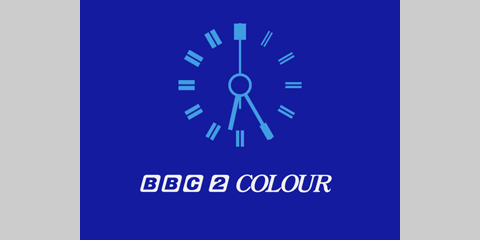
When BBC 2 started broadcasting some of its programmes in colour, in July 1967, they continued to use the black and white clock above, to which colour was added using a 'synthesiser'. The official launch of colour came in December and with it came a new symbol - a 2 with a dot in it. The clock was updated accordingly.
BBC 2 Service Information Clock
The clock was also used to introduce Service Information, a programme not listed in the schedules, which gave out transmitter information to the television trade. A different colour scheme was used from the main clock.
This was the BBC 1 clock used from the launch of the channel's new colour service in November 1969. It was reportedly the work of senior designer Alan Jeapes, who used hour markers of increasing thickness. As with the BBC 2 clock, this was shot using a black and white camera. Colour was then added to the picture. This clock face would continue to be used for over a decade.
The new BBC 1 clock design was also adopted by BBC 2. But here, as with the station's ident, the BBC logo was absent.
By 1971, the BBC 1 clock had been modified with the new BBC corporate logo, which now had rounded corners.
By 1972, the BBC network clocks had been modified again. The "COLOUR" label changed from a sans-serif font to a Roman font and was now in italics. "BBC COLOUR" in this style would now also appear at the end of the credits for most BBC productions.
BBC Midlands Clock
BBC Midlands Clock - Christmas
A photograph of the BBC Midlands clock shown over Christmas in 1973 was published in an article in the May 1978 edition of Television magazine. It's re-created here along with the standard version of the clock.
BBC 1 Clock - Black & White II
On February 7th 1974, Blue Peter was introduced with a clock that had the word "COLOUR" missing, and the announcer told viewers, "today's programme is in black and white." Black and white programmes from the same era could also be introduced with a similarly labelled BBC 1 globe. (Wikipedia notes the first colour edition of Blue Peter aired on September 14th 1970, but the programme was still being shown in black and white as late as June 24th 1974.)
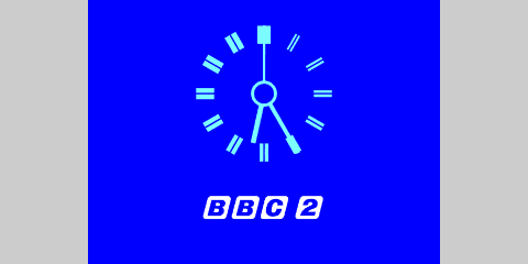
The BBC 2 clock from 1972, with the corporate identity on display again. There was now a blue background to help distinguish the clock from that seen on BBC 1.
BBC 2 Clock - Three Colours
BBC 2 Clock - No Line
A third colour was added to the BBC 2 clock to match the station's ident - showing the BBC logo, lettering and line in white. At some point, the horizontal dividing line was dropped from the clock and, at the end of 1974, it was removed from the idents of both channels, too.
The clock design seen in the 1970s on BBC 1 and BBC 2 was also used to introduce Service Information. As well as the green-on-purple variant seen here, many other ghastly colour schemes were experimented with such as purple on green, green on white, pink on light blue, light blue on pink, yellow on brown, brown on yellow and green on red.
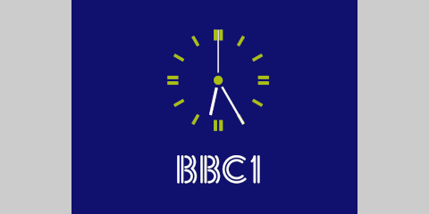
After Christmas 1974, a new design for the BBC 1 globe appeared. Three colours were now used and the channel name was now larger and used the Futura Bold typeface. The new lettering and colour scheme were also applied to the clock. Then, at some point in 1975, the second hand was replaced with a shorter one, so that it no longer extended through the other side of the ring in the middle.
Although BBC 1 appeared in Futura Bold underneath the globe, clock and schools symbols, the channel name appeared in a new twin-striped font elsewhere, such as programme slides. In 1975 this new style appeared on the Christmas ident for the first time. Here you can see it being used again at Christmas 1976.
Northern Ireland, Scotland and Wales each had their own globes and clocks based on the three-colour BBC 1 network models. This is the clock used by BBC Cymru Wales.
BBC 1 Scotland Clock
BBC 1 Scotland Clock - Black
This was the BBC 1 clock seen in Scotland. In December 1980, BBC Radio Scotland's Good Morning Scotland was simulcast on TV in an experiment called Radiovision. The clock leading into this used a different, blue-on-black, colour scheme.
BBC 1 Midlands Clock
BBC 1 North West Clock
The BBC English regions also had their own on-screen identities. The BBC 1 Midlands clock kept the longer second hand from the original clock face, but the BBC 1 North West clock followed the network's update to a shorter second hand.
The BBC 1 South clock looks the same as the network clock at first glance, but on closer inspection, the clock face is slightly smaller, as is the ring in the middle and the hour hand appears slimmer too.
When BBC 2's new stripy cylinder ident launched after Christmas 1974, a new square clock design came with it. The ident and clock were about the same height and width, allowing for a pleasing transition between the two images.
BBC 2 Clock
BBC 2 Clock - Black
In early 1975, BBC 2's new clock was abandoned in favour of the old design, shared with BBC 1. There was also a lesser-spotted black version of this clock.
BBC 2 Clock - Twin Stripes
BBC 2 Clock - Twin Stripes - Christmas
In 1979 a new BBC 2 ident took to the air, the first to be played out from a solid-state device. The new clock, though, remained a mechanical model with a camera pointing at it, for now. The colours were tweaked to produce a festive version for Christmas that year.
BBC 2 Clock - Electronically Generated
Around autumn 1980, BBC 2's mechanical clock was replaced by a box of electronics, designed in house by Richard Russell. This allowed the network symbol underneath the clock to be properly shaded. Similar hardware was rolled out to BBC 1 the following year.
It wasn't until September 1981 that BBC 1 finally adopted the twin-stripe design first used on its programme slides and Christmas idents in the previous decade. The stripy lettering also brought back some consistency across the BBC's two channels. A new globe meant a change from yellow to lime green. And the clock also got some new hands. This mechanical clock would be replaced within a couple of months...
BBC 1 Clock - Electronically
Generated
Revised
BBC 1 Clock - Electronically
Generated - Christmas
NEW!
BBC1's first electronically-generated clock arrived in late 1981. Over Christmas 1984, it was presented in purple with a white shadow, perhaps to suggest it had been left out in the snow. Viewers would need to stay up until closedown to make sure they saw it and each night the shadow would be in a slightly different positon.
BBC 1 Scotland Clock - Twin Stripes
BBC Scotland Clock - Twin Stripes
The nations' versions of the stripy clock remained mechanical. Viewers in Scotland were treated to a new dial design. Then in 1983, BBC 1 Scotland shortened its name to BBC Scotland.
BBC 1 Clock - Electronically Generated II
This is BBC 1's second virtual clock, introduced in February 1985 to accompany the new virtual, golden globe symbol, known inside the BBC as COW (Computer-Originated World) or OWL (Open World Logo).
BBC 2 Wales Clock - Electronically Generated
BBC 2 moved away from dual stripes at Easter 1986. Its new ident spelled out TWO in a 3-D stencil typeface casting a shadow onto a white background. The clock had a similar look, but the nations' clocks were simpler, flat designs, with no shadows. Each nation chose its own colour scheme. This is how the clock looked in Wales.
BBC 1 Clock - Electronically Generated III NEW! Sa 4-Oct-25
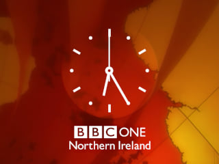
In October 1997, BBC 1 became BBC One, with idents showing a hot air balloon flying across different parts of the UK. The rebrand also introduced a new corporate logo, which you can see here on the revamped clock.
BBC 1 N. Ireland Clock - Electronically Generated NEW! Sa 4-Oct-25
The nations and English regions also got versions of the new clock. This is how it appeared in in Northern Ireland.
Thanks to Nathan Dane for the background image.
Schools & Colleges
After the introduction of colour, many programmes were still shown in black and white, including all schools programming. So there was a second BBC 1 clock, seen here, without the "COLOUR" label on it.
BBC 1 Schools Diamond
BBC 1 Schools Diamond II
Once schools programmes were being made in colour, they were introduced by an animated diamond. If the upcoming programme was for primary schools, the two-minute sequence was accompanied by Sara's Tune by David Lord. Secondary schools programmes used a track by Inigo Kilborn. In 1975 the diamond turned yellow to match the BBC 1 globe and clock.
BBC 1 Clock - Schools Variant
BBC 1 Clock - Schools Variant II
The BBC 1 network clock changed at the end of 1974 with the channel name now in white. But around schools programming the lettering was yellow to match the schools diamond. This was perhaps because the diamond model was originally designed to support just two colours.
BBC 1 Schools - Follows Shortly
For longer gaps in the schedule, this diamond-themed holding slide would appear before the diamond sequence to explain the next programme was on the way. A second version of this caption had more colours and text that was properly centred against the background!
BBC 1 Schools Dots
BBC 1 Schools Dots II
The 60-second countdown clock that replaced the diamond symbol, used before the BBC's schools programmes from September 1978. The first version had a rotating middle. Later, the middle would remain stationary.
BBC 1 Schools Dots III
BBC 1 Schools Dots - Electronically Generated
In September 1981, the BBC 1 clock, globe and schools countdown switched to using twin-stripe characters and a modified colour scheme. The BBC Designs Department then created EAGLE (Electronic Announcements, Graphics and Logo Equipment) to replace physical captions. EAGLE generated the final iteration of the schools countdown, where the white dots now faded to black. This was used until Friday, June 24th, 1983, the last day of schools programmes on BBC 1.
On Monday, September 19th, 1983 schools programmes moved to BBC 2. They were billed under the heading Daytime on Two and instead of a countdown, a daytime version of the BBC 2 symbol appeared ten seconds before each programme. With no Schools, BBC 1 closed down after Breakfast Time and started up again for Play School, which had also switched sides. It would be another three years before BBC 1 had a full daytime schedule.
The Open University
In January 1971, BBC 2 began broadcasting programmes to accompany courses from The Open University. Each block of programmes would begin and end with an animated OU symbol and the sound of the fanfare from the opening of Divertimento for Three Trumpets and Three Trombones composed by Leonard Salzedo. Click/tap the link to remove the colour and reveal how how a rotating disc and vertical blinds might have produced the animation.
BBC 2 OU
BBC 2 OU - Twin Stripes
As well as the animated symbol, viewers might see a clock (see below) and a caption reminding them which channel they were watching. This was especially important once BBC 1 also began broadcasting OU programmes.
The OU on BBC 1 - Electronically Generated I
The OU on BBC 2 - Electronically Generated I
In the Eighties, the blue-on-yellow OU ident was replaced by idents that followed the style of the channel that was broadcasting the programmes. They were generated electronically by a system called MOUSE (Microprocessor Open University Symbol Equipment).
The OU on BBC 1 - Electronically Generated II
The OU on BBC 2 - Electronically Generated II
When BBC 1 and BBC 2 re-branded (in 1985 and 1986, respectively), the OU idents were updated to match.
This was the clock that was used to fill time if there was a gap before the first OU programme. The clock and the animated symbol were mechanical models to begin with.
The OU Clock - Electronically Generated
The OU on BBC 2 Clock
This is the first electronically-generated version of The Open University clock. This was then replaced by an OU clock for each channel. The BBC 2 version is shown here.
Test Cards
In the early 1970s, the BBC began using an electronically generated test card, known as Test Card G, based on a design by Philips. This is how it looked on BBC 2.
As well as the standard test cards with grey squares and/or coloured bars, there were a couple of other test cards used by the BBC. The first is a pulse and bar pattern, which included a burst of lilac. The two vertical lines on the right-hand side show that the card was transmitted from Cardiff. Different arrangements meant sixteen different regions could be identified in this way. The second pattern is called a multi-burst and features frequency gratings.
Other pages in the TV Logos section...
- Section Contents
- THAMES Logo Parade
- BBC Logo Gallery
- BBC 1 1985
- Station Idents from the Seventies
- Station Idents from the Eighties
- ITV 1999
- ITV 2002
- ITV 2003
- ITV 2004
- BBC Flash-free Files
- More Flash-free Files
- Flash Files
- More Flash Files
- LWT Flash Files
- Screensaver Flash Files
- Cult Programme Logos
- Worst Logo Competition
Other Related Web Sites
- It was in 1979 that the BBC's Richard Russell began working on the first fully electronic clock for television. You can read about his experiences working for the Corporation at the BBCeng.info website.
- Dave Jeffery has created a video showing what the BBC 2 clocks from 1967 would have looked like, as well as a video of his re-creations of many of the BBC 'polo mint' clocks. There is also a demo of how the OU ident may have worked.
- You can download a PDF version of the May 1978 edition of Television at americanradiohistory.com that has an article on the BBC's unusual test cards and captions, and includes a screenshot of the BBC Midlands Christmas clock.
- For more regional clocks, TVARK has a large selection of stills and video from the BBC nations and regions. They also have a section on The Open University.
- An article in the Rewind section of The TV Room discusses how the BBC 2 clock went electronic and the later clocks seen in the nations, including a link to video of the BBC 2 Wales clock. The same site also has footage of the BBC 1 Christmas clock from 1984.
- The Winter 1981/1982 edition of ENG INF describes the EAGLE and MOUSE systems (used for the electronic BBC Schools dots countdown and OU animation, respectively). You can download a PDF version from the BBCeng.info website.
- Jason Robertson's sub-TV site has a section devoted to BBC Schools.
- YouTube has Super 8 footage of the BBC Cymru Wales clock. There's a look around the clock device on Vimeo.


